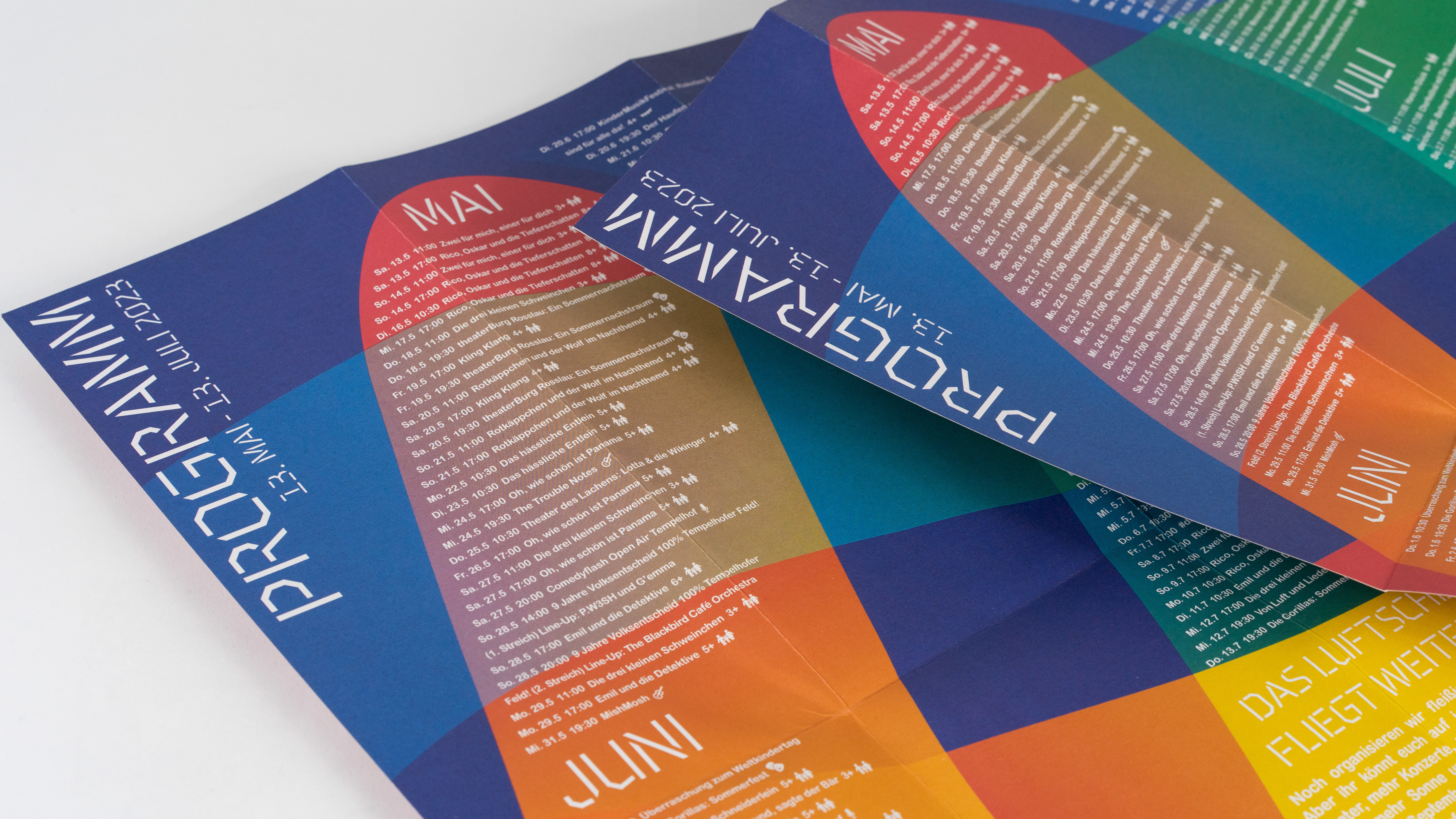
for several years I have worked with Atze musictheater in Berlin, taking care of the graphic design and visual identity of the Luftschloss Tempelhofer feld. Located in a former airport which is now a lively Berlin park, the Luftschloss is an impressive outdoor amphitheatre beautifully constructed from wood.
Corporate design:
Firstly I worked with the client to develop a corporate design for the luftschloss (Logo, Type, Colour scheme):
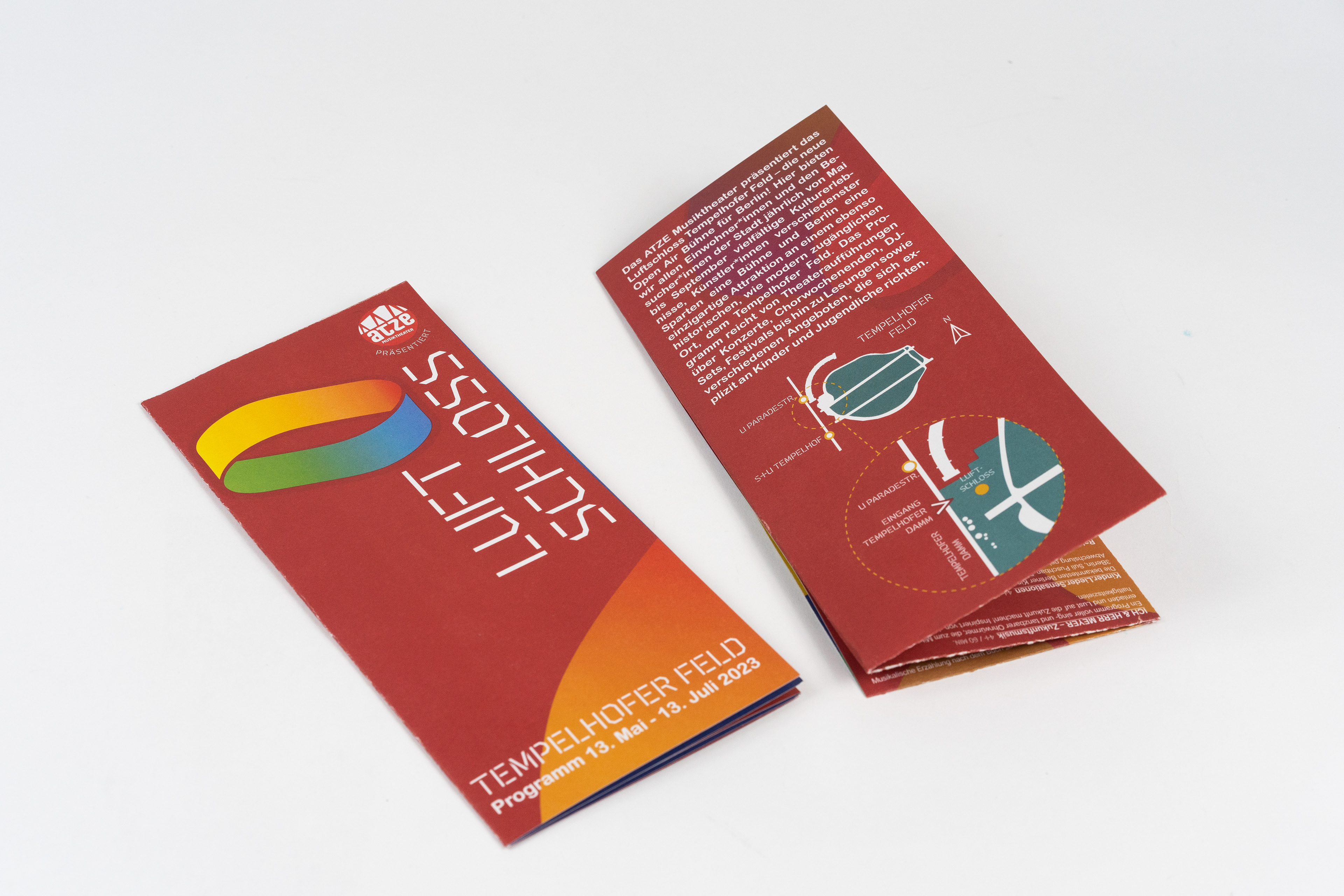
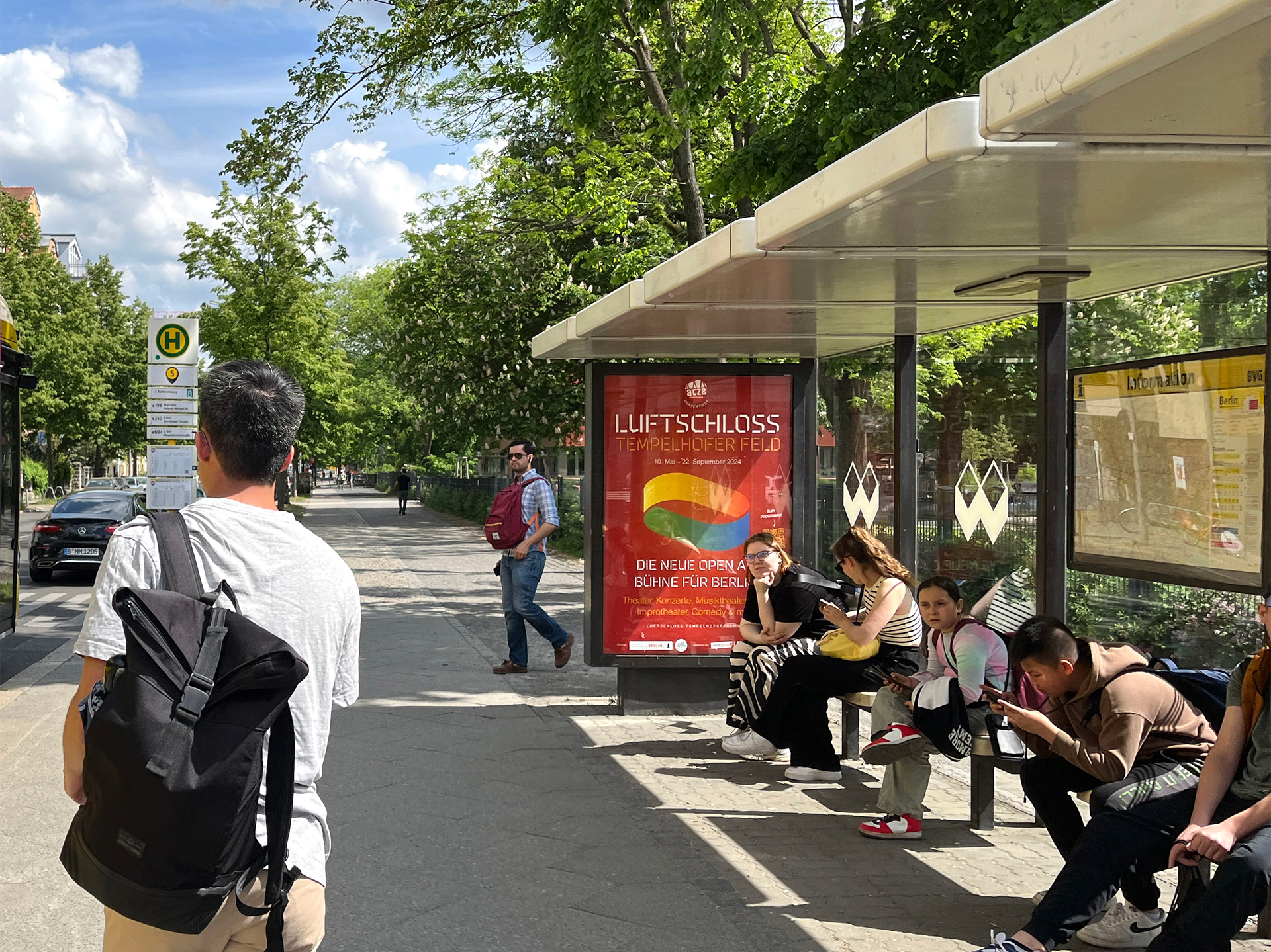
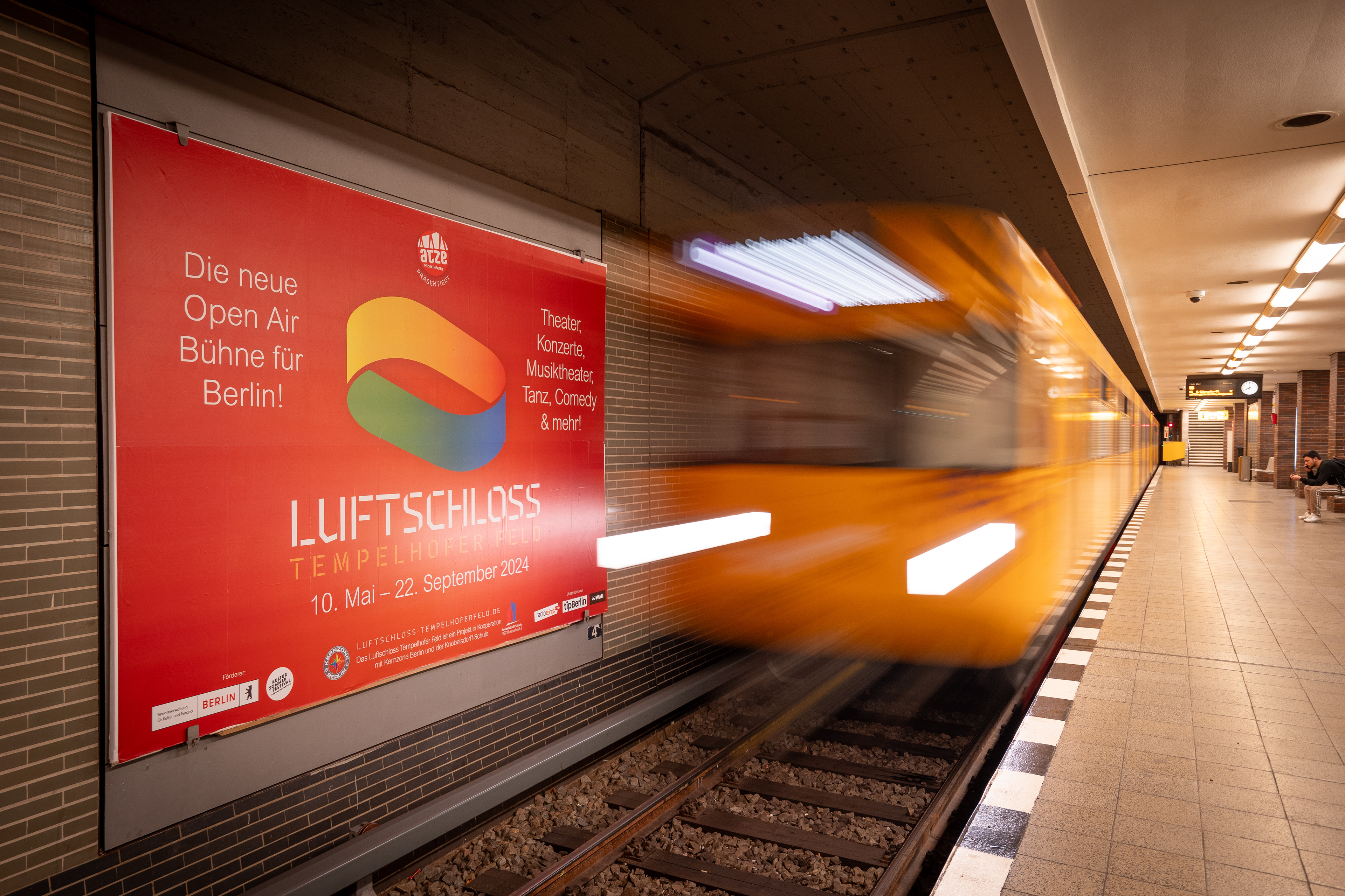
The successful 2024 Luftschloss Advertising campaign, visible all over Berlin.
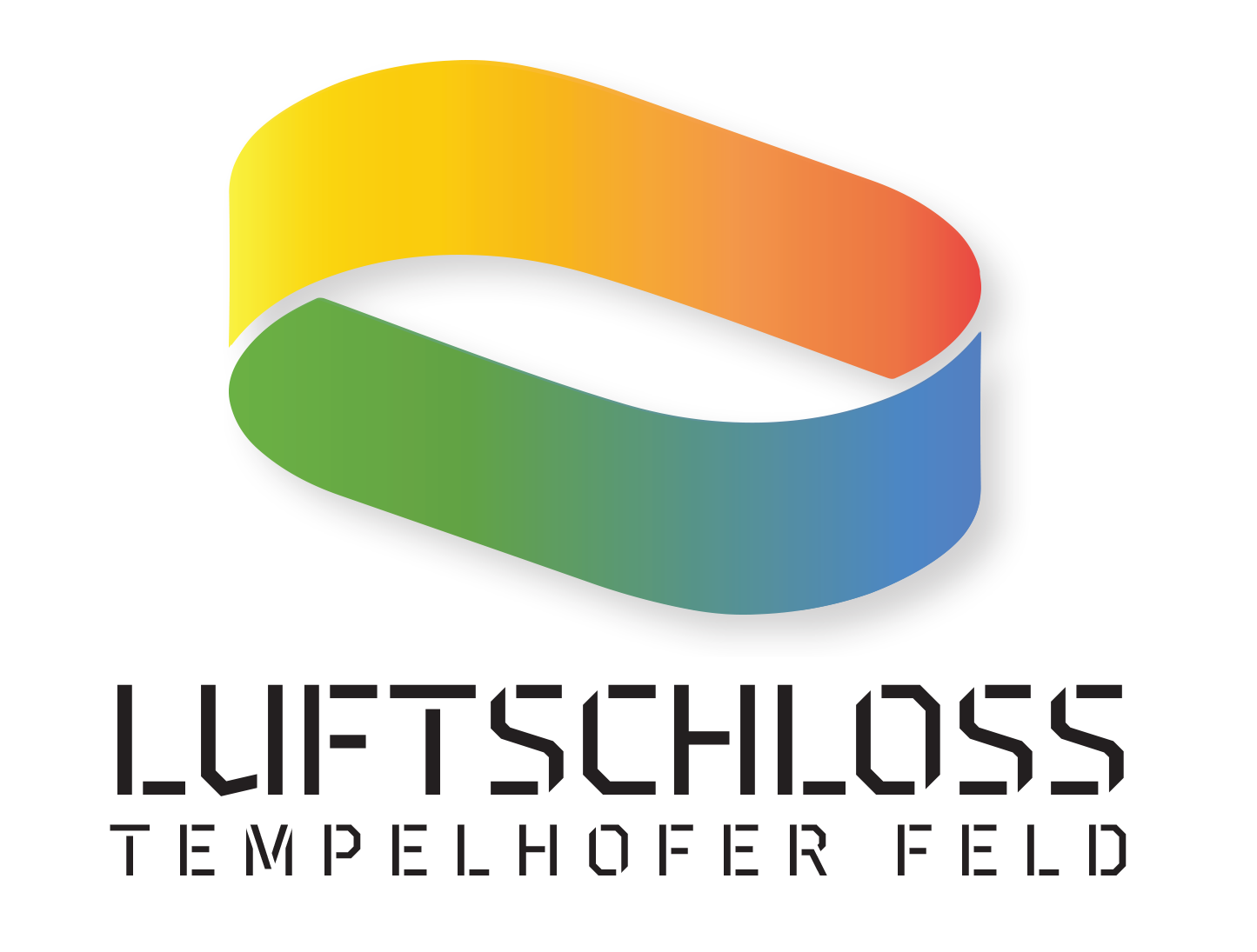
After some consultations with with the client to discuss their needs and get a sense of what the project is about, I came up with several logo concepts. From these, the client chose one to be developed to a final stage. In the final design, there were 4 main elements:
1. Form: The form of the logo is based on the architectural form of the amphitheatre itself.
2. Floating Mobius loop: ‘Luftschloss’ in German translates literally as ‘palace in the air’, and is another way of saying ‘Pipe Dream’ in german. Both of these references informed the design of the logo, by making the logo an impossible or imaginary form as a type of mobius loop, that seems to float in space.
3. Colourscheme: the client wanted to Highlight the diversity of both the audience and the performance programme at the theatre. This influenced the a bold multicolour-scheme, which is used in a gradient to blend the colours together into a whole.
4. Type: The stencil font was chosen as a reference to the beautiful hand-craftsmanship of the amphitheatre construction, and to the D.I.Y. ethos of the team running the project.
